Feedback on initial ideas
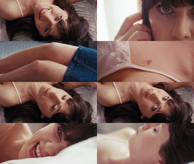
At first, our idea was to have our singer just messing around at home, having fun. We were also going to have someone play "Valerie" and throughout the video show the audience her different features.. I.e; Her eyes, her hair, her smile. Similar to how it is done in this photo:

We were very ambitious with our ideas, perhaps a little too ambitious, because a lot of the effects we wanted couldn't be done, either because they were too complicated or too expensive.
Initial feedback was that although our idea was good we would have to change quite a lot of it because of difficulty producting it. There also was an issue of us getting a set of drums and someone who could play them.
Feedback on rough cut
The feedback for our rough cut made us know exactly what to change and how to change it. It was said that our rough cut had "atmospheric lighting" which is what we intended on having as we thought it helped emphasize the concert aspect of our video. We were also told that the video was "simple yet effective" this was intended as we did not want to confuse the audience with a complicated narrative. Some constructive criticism was that towards the end the lighting wasn't as good as it had been previously in the video. We took this on board and chose to re-shoot the ending.
Class feedback on digipak roughs
Our inital idea was to show both sides tou our singer in the digipak and magazine. We wanted it to be qplit down the middle, with half of her dressed as the singer and the other half in her pyjamas. After much discussion we decided that this wasn't what we were going to do as it needed time that we just didn't have. I was told that although the photos for my digipak were of a good quality the lighting was quite dark, as a group, we decided to re-shoot.
But, when I began my second attempt at making my digipak, I realised that some of the photos were still quite dark and as we didn't have enough time to re-shoot again, I decided to adjust the brightness of the photos in photoshop which worked really well. The second time we took the photos we found it much easier as we knew exactly what shots we wanted for our digipak and magazine advert.
Feedback on final version of everything
It was said that the final version of our music video was mainstream and didn't "break any rules," I agree with this statement, as we intended on making both our music video and artists mainstream, to appeal to a wider audience. Many thought that our singer was perfect as she suited the role and gave the video a "down to Earth" feel to it, which my group and I were very happy about as it took us quite a while to decide who we were going to present as our artist.
India said; "I liked the whole performance based theme and keeping it consistent. The different angles and lighting and effects merged together really well. The quality could be a bit better but other than that I really liked it." My group and I have had quite a few problems with the quality of our video. During editing the quality was good and consistent, but once exported to YouTube our video lost a lot of that quality.
Overall, my group and I are quite pleased with the out come of our music video, digipak and magazine, and all worked very hard to achieve them.

No comments:
Post a Comment