Friday, 17 December 2010

Wednesday, 15 December 2010

Evaluation Task One: In what ways does your media product use, develop or challenge forms and conventions of real media products?
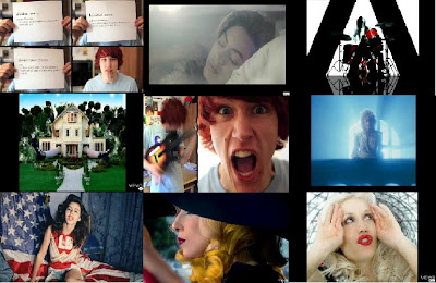
Image 1: This image demonstrates lip-syncing in time to the music which, due to good editing, makes the music video appear professional. This is a close up of the singers mouth, as well as giving it a more intimate feel, there is also a slight sexual element.

Image 2: This is a medium close up of Debbie in her pyjamas. As a company, we don't want the audience to feel intimidated by our singer and what to give the impression that she is a normal young woman, with an average lifestyle. The message we want to portray is that anyone can do anything as long as they set their mind to it. The medium close up shows her surroundings as well as showing some facial expression and body language.

Image 3: As Valerie is a Rock & Roll song, the image of the drums will enhance this genre and could draw in a Rock & Roll audience. The use of drums in this medium shot, enhances the genre of the music video, as well as making the audience familiar with the drummer.

Image 4: This image shows Debbie and also her "alter ego." The inspiration for this shot was "Hannah Montana" as she leads two lives; the life of Miley, which is her normal life and also the life of Hannah, which is her "pop star" life. As our target audience will watch Hannah Montana, the narrative will draw them in even more.

Image 5: This is a medium shot of the singer. It shows some detail of the singer and also shows the background, which is completely black. The black connotes mystery and reinforces the fact that she is in a concert.

Image 6: In this show of the drums, we decided to use red gels to create this effect. We had a meeting about how we could make it look like a concert and decided to use different coloured gels to help us even more. We used red as it signifies love but also gives it a sense of risk and danger. The close up of the hands shows the importance of instruments in the rock 'n' roll genre.

Image 7: This image demonstrates our use of mise-en-scene. As we chose pink to be our motif, to keep it continuous we decided to use a pink radio in this shot as well as a pink duvet cover. It is a medium close which allows the audience to see the background as well as the singer.

Images 8 & 9: Both shots demonstrate my research into music videos as the idea for a normal life and then a concert was inspired by Kelly Clarkson's "My life would suck without you."

Image 1: The visuals in this shot match the lyrics. The lyrics for this part of the song are "She got two sibilants, no bilabial plosives." As the singer sings each word, he lifts a piece of paper up with the definition of it. Throughout this shot the audience doesn't lose any intimacy with the singer as he remains in the lower left hand corner. This image was taken from Charlie McDonnell's video for Saskia Hamilton by Ben Folds. Ambi editing is used in this part of the song which is effective as the audience don't see the same image for too long.

Image 2: This image was taken from Halo by Beyoncé. Usually, Beyoncé is presented as a sex symbol, however, in this video she is presented as quite soft and beautiful. This shows the audience that even though Beyoncé can be sexy she can also be quite timid. The lighting in this shot makes the singer look almost angelic and holy.

Image 3: This image makes it very clear to the audience that it is a rock video/song by the use of instruments (drums and guitar). The image was taken from The White Stripes' video for 7 Nation Army. The use of black gives the video an edge to it as black connotes mystery and the red creates a sense of risk.

Image 4: This shot from Gwen Stefani's song What you waiting for? shows her as a giant in a little cottage. This idea was clearly taken from Alice In Wonderland and was adapted for the video. This long shot shows the audience the background which helps them to make more of a connection with Lewis Carol's Alice In Wonderland.

Image 5: This shot has both a medium close up and a close up of the singers face. The close up of his face shows his emotions and reactions clearly to the audience. The medium close up shows the singer playing the guitar which emphasizes the Rock genre.

Image 6: This image from Total Eclipse Of The Heart makes Bonnie Tyler appear quite angelic and pure as the white light from behind is shining on her in a way that makes her look pure. This medium close up allows the audience to see some emotions, but not enough to have an intimate effect.

Image 7: Mise-en-scene is demonstrated in this shot as the American flag is a motif used in this video. In the bedroom, this motif is kept continuous as she is sitting on an American flag, and the room itself and everything else in it is blue. This image was taken from Hollywood by Marina and The Diamonds.

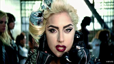
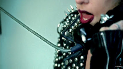
Images 8 & 9: Both images are close ups. This creates an intimate feeling for the audience. Both Lady GaGa and Gwen Stefani are wearing red lipstick, this connotes love or lust.

Tuesday, 14 December 2010

Evaluation Task Two: How effective is the combination of your main product and ancillary texts?
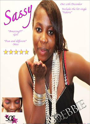
The two images on the left were taken from the finished music video and the two images on the right were taken from the digipak.
The first image relates to the photo of Debbie with her eyes closed. Both photos show the continuity of the colour pink as our motif. This photo of Debbie is used for the front of the digipak as we want our artist/brand to be associated by the colour pink, especially as our target audience are mainly young girls. One reason we chose to use the colour pink is that it is a bright and energetic colour.
The remaining images were used to present her "normal" life, as a teenager. In the digipak, we didn't want to only focus on her life as a singer, as that isn't the message we want to convey.

The magazine advert and digipak were made to be very similar as to create a brand. Again, we used the colour pink for the title and also for the logo. There is a clear background in both the digipak and magazine so that the main focus is on our singer and the colours.

Evaluation Task Three: What have you learned from your audience feedback?

Feedback on initial ideas

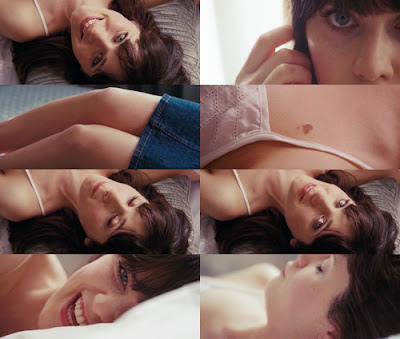
At first, our idea was to have our singer just messing around at home, having fun. We were also going to have someone play "Valerie" and throughout the video show the audience her different features.. I.e; Her eyes, her hair, her smile. Similar to how it is done in this photo:
We were very ambitious with our ideas, perhaps a little too ambitious, because a lot of the effects we wanted couldn't be done, either because they were too complicated or too expensive.
Initial feedback was that although our idea was good we would have to change quite a lot of it because of difficulty producting it. There also was an issue of us getting a set of drums and someone who could play them.

Feedback on rough cut

The feedback for our rough cut made us know exactly what to change and how to change it. It was said that our rough cut had "atmospheric lighting" which is what we intended on having as we thought it helped emphasize the concert aspect of our video. We were also told that the video was "simple yet effective" this was intended as we did not want to confuse the audience with a complicated narrative. Some constructive criticism was that towards the end the lighting wasn't as good as it had been previously in the video. We took this on board and chose to re-shoot the ending.

Class feedback on digipak roughs

Our inital idea was to show both sides tou our singer in the digipak and magazine. We wanted it to be qplit down the middle, with half of her dressed as the singer and the other half in her pyjamas. After much discussion we decided that this wasn't what we were going to do as it needed time that we just didn't have. I was told that although the photos for my digipak were of a good quality the lighting was quite dark, as a group, we decided to re-shoot.
But, when I began my second attempt at making my digipak, I realised that some of the photos were still quite dark and as we didn't have enough time to re-shoot again, I decided to adjust the brightness of the photos in photoshop which worked really well. The second time we took the photos we found it much easier as we knew exactly what shots we wanted for our digipak and magazine advert.

Feedback on final version of everything

It was said that the final version of our music video was mainstream and didn't "break any rules," I agree with this statement, as we intended on making both our music video and artists mainstream, to appeal to a wider audience. Many thought that our singer was perfect as she suited the role and gave the video a "down to Earth" feel to it, which my group and I were very happy about as it took us quite a while to decide who we were going to present as our artist.
India said; "I liked the whole performance based theme and keeping it consistent. The different angles and lighting and effects merged together really well. The quality could be a bit better but other than that I really liked it." My group and I have had quite a few problems with the quality of our video. During editing the quality was good and consistent, but once exported to YouTube our video lost a lot of that quality.

Overall, my group and I are quite pleased with the out come of our music video, digipak and magazine, and all worked very hard to achieve them.

Monday, 13 December 2010

Evaluation Task Four: How did you use new media technologies in the construction and research, planning and evaluation stages?

Saturday, 11 December 2010

Telephone- Lady GaGa Ft. Beyoncé Analysis
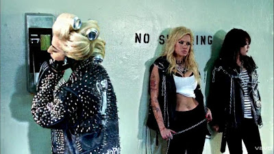

The music video officially starts at 2:50 when Lady GaGa receives a phone call from Beyoncé. Judging by the high fences and barbed wire that goes around them, GaGa seems to be in a high security women's prison. She is wearing mostly black at first which could connote sophistication and mystery. This ties in well with the music video (but not so much with the lyrics to the song) as the audience do not know why she's in this prison and what the main objective of the music video is. The many small silver studs on her jacket and bra give her outfit and her persona an edge to them. Silver also signifies glamour and wealth. At the back of her jacket the studs look quite pointed and sharp which makes her look quite dangerous. The two women either side of Lady GaGa also help to keep the theme of danger as the blonde woman is holding a chain and the brunette has chains around her, which signifies that they are trapped and are being restricted.

The close up on her face lets the audience see her emotion and reaction to the phone call. She is wearing red lipstick which signifies love, lust or danger. The drama of a close up can be amplified by an unusual angle which is done during the close up of her mouth.
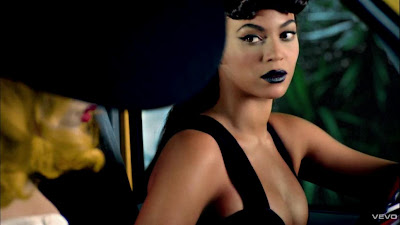
Ambi editing is used during this video which keeps the audience entertained as they aren't stuck on the same image for too long, it also lets the audience enjoy the beat to the music. Later on in the video, Beyoncé is introduced to the audience by bailing Lady GaGa out of jail. Both women are wearing black which enhances the theme of mystery, however, Lady GaGa is also wearing white. White connotes purity, innocence, softness and is usually associated with light. The white makes Lady GaGa seem almsot angelic. The use of costume in these frames could give the audience the impression that Lady GaGa is "good" and as Beyoncé is in all black, that she is "bad."

This music video has a narrative but also promotes both artists. Cutting to the beat is essential and is used to maintain the relationship between the visuals and the temp of the music. High key lighting is used to make this video seem realistic.

Friday, 10 December 2010

Our Choices

My group and myself had to decide from three songs:

-Get Shaky- The Ian Carey Project
-Rehab- Rihanna
-Valerie- Amy Winehouse and Mark Ronson

We thought "Get Shaky" would have been a good song to do as it has a fast beat which will be useful when we come to editing and as the tempo is quite fast we could do a lot of matching cuts. The problem with "Get Shaky" was that we couldn't think of many ideas.


We then thought "Rehab" would have been a good idea but after we listened to it many times we realised that even though we'd be able to come up with many ideas, the pace of the song was quite slow so ambi editing would have been harder to use.


We finally came to the conclusion to use "Valerie" as it is an upbeat song and we'll be able to use ambi editing and also be able to think of appropriate video ideas.

Thursday, 9 December 2010

Tuesday, 7 December 2010

Mark Ronson and Amy Winehouse


Mark Ronson and Amy Winehouse covered "Valerie" for Mark Ronson's second studio album called Version. This version was released 15th October 2007 in the UK and 30th July 2008 in the USA. The genre of the song is a mixture between R&B, Rock & Roll and Jazz.
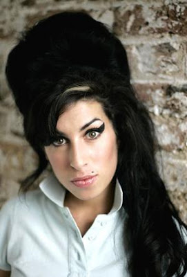
The single spent 19 consecutive weeks in the "Top 20 UK singles charts" and peaked at number 2. It sold 329, 490 copies and became the 9th best selling single of 2007.

The song received a nomination for British Single but lost to "Shine" by Take That.
The beginning of the song, Amy Winehouse is heard saying "I'm sorry Charlie Murphy, I was having too much fun." This is a reference to the Rick James skit from Chapelle's show.

Monday, 6 December 2010

Mark Ronson- Making of "Valerie"

http://www.youtube.com/watch?v=9TZQ4kbJsoc

In this video, Mark Ronson speaks about the making of "Valerie" and also the concept of the video.

Sunday, 5 December 2010

Meaning Of The Lyrics


"Valerie" was originally a song by "The Zutons"

The meaning of the song is fairly simple. It is originally about the lead singer missing his ex.

Saturday, 4 December 2010

Inspiration

The inspiration for a part of our music video came from a HP advert.


We aimed to achieve a similar effect for our music video when the singer says certain words or phrases, for instance "water" or "paint a picture."
However, after researching the technique and speaking to our media technician we then realised that trying to achieve this effect would be extremely time consuming and would need a lot of hard work and very expensive equipment. Our technician suggested that we try to achieve a similar effect by using paper or using pour creative skills to try and imitate the technique at hand.

Friday, 3 December 2010

Inspiration 2

In one of our shots, my group and I would like our singer to spin and change clothes, Similar to how Charlie McDonnell does it in his video "Superhero Costume"
Between 2:02 seconds and 2:06 seconds

Thursday, 2 December 2010

Planning & Initial Ideas

Settings:

Bedroom: This is where the girl will wake up in the morning and put her radio on. Not a lot of time will be spent in this room.

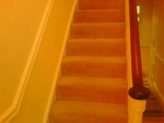
Hallway: This is where the girl will walk down the stairs while singing. After the jump cut of her walking down the stairs, she'll sit on the bottom step whilst singing. She'll then begin to sing in the mirror with a hairbrush.

TV Studio: This is where all of the footage of her singing at the concert will be.


Costume:

Blue shirt
Black shorts
Black tights
Pink leg warmers
Dress

Props

Hairbrush
Radio
Mirror
Drums
Microphone
Lipstick


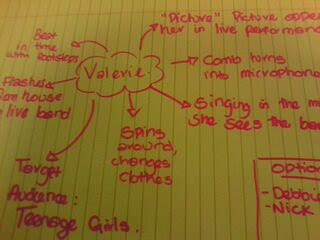
Initial Ideas

-Beat in time with footsteps
-Flashes from her house to the live band
-Target audience: Teenage girls
-Spins around, changes clothes.
-Picture appears of her in live performance when she sings "picture"
-The comb turns into a microphone
-While singing in the mirror, an image of the band is seen.

Wednesday, 1 December 2010

Meeting One


We did a brain storm on random ideas that we could include in our video and are also in the process of story boarding with sticky notes.