Tuesday, 30 November 2010

Target Audience


photo


Our music video is targeted at pre-teens. As our music video is similar to Disney's "Hannah Montana" as our protagonist has "The best of both worlds"

Our singer is also a very likeable and "happy-go-lucky" character and will appeal to "tweens" which are usually aged between 10 and 14/15.

Our main target audience will be dominantly female as our singer is female and also because a lot of female related colours i.e pink.


Monday, 29 November 2010

Meeting Two


More Ideas:

-Fade from her normal clothes into sparkly dress, then back into her pyjamas.
-Singing while doing jump cut. (Will need to have singer lip syncing all of the song on each step)
-Singing in the mirror, the mirror image then turns into an image of her singing at the concert.
-The hairbrush turns into a microphone.
-Singer and drum set in the frame, singer becomes blurred by the drum set is seen very clearly and then vice versa.
-The end of the music video will be focused on the singer and the band, similar to how it is done in "My Life Would Suck Without You" by Kelly Clarkson


This video is also a good example of a video that switches between narrative and performance, which is what we are trying to achieve in our video.

-During the jump cut scene there will be a change of costume. This quick flash is similar to that in "Fight Club" of Tyler Durden. This will confuse the audience and keep their attention.

EXTRA IDEAS!!

-Close up of "Valerie's" features. (Ginger hair, eyes, mouth)
-Singer dancing with a boa
-Close up of her eating a grape


Sunday, 28 November 2010

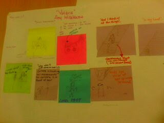
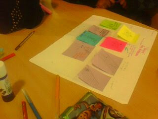
Storyboard


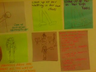
Drums instrumental. Close up of drums.
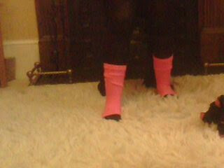
Well Sometimes I Go Out, By Myself, And I Look Across The Water: Close up of her leg warmers, shirt and then a match on action of the singer putting the radio on.

And I Think Of All The Things: Jump cut of her working down the stairs.

Of What You're Doing, And in my head I Paint A Picture: Sitting on the bottom step lip syncing.

Since I've Come Home, Well My Body's Been A Mess, And I Miss Your ginger Hair, And The Way You Like To Dress, Oh Wont You Come On Over, Stop Making A Fool Out Of Me: Mirror image will change into her singing at the concert with the band.

Why Dont You Come On Over, Valerie (x3): Camera is tracking her movements and she lip syncs "Valerie" just before she begins to spin.

Did You Have To Go To Jail, Put Your House Out Up For Sale, Did You Get A Good Lawyer: Spin and then change of clothes.


Saturday, 27 November 2010

Plot Summary Including Camera Angles

Our music video begins with drum being shown. We will show a headshot of the drummer and a close up on the drummers foot on the pedal. It will then cut to a girl waking up in bed, turning over and then there will be a match on action of her putting the radio on. Our next cut will involve ambi editing as we will have jump cuts of her walking down the stairs. On the second step her clothes would have changed from her pajamas to a dress and pink high heels and on the third step her clothes would have changed back into her pajamas. The quick change of outfit will grab the audiences attention and make them wonder what is going on. On the last step there will be a long shot of our singer sitting down singing.

It'll then cut to her standing in front of the mirror singing into a hairbrush, her mirror image will then turn into an image of her singing at the concert. There will be a close up of her face and facial features and then a side view of her face. The camera will then track her movements and there will be close ups of her feet.

We will have a long shot of her singing the word "Valerie" and then there will be a birds eye view of her spinning around. During this show, her clothes will fade into her dress and then fade back out into her pajamas. After this the camera will act as a mirror for our singer and there will be a close up of her applying lipstick.

She'll walk towards a door and there will be a close up of her hand on the door knob and then a close up of her walking in her tights and it will then change into a close up into her high heels. There will be panning from her shoes all the way up to her face, revealing that her outfit has now changed into the dress for good.

The rest of the music video will be of her and the band performing. This will include:
- Low angle shots of the drums
- High angle shots of the drums
- The drums will be blurred with a clear view of the singer and then vice versa
- Close up of drummers foot
- Close up of drumsticks
- Close ups of singer
- Both high angled and low angled shots of the singer

Friday, 26 November 2010

Practice Lip Sycning


We made our artist practice lip syncing before we started filming to see how capable she was of doing it and to make sure that she knew the lyrics.

Thursday, 25 November 2010

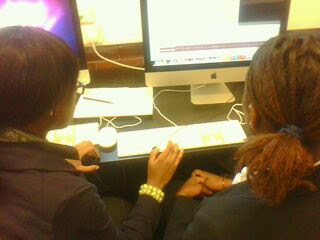
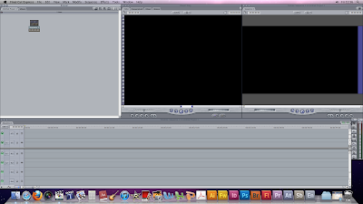
Final Cut Pro Training


Format:
-If filmed in HD: Choose HD, HDV-Apple Intermediate codec 1080i50
-If filmed in Standard Definition: Choose Pal, DV-Pal

Then we had to go to macintosh HD, Primary scratch disk, Choose folder, Users, Shared, Sara Abel.

We then dragged our chosen song into Final Cut Pro, to render it we had to:
Go to "sequence", "render all" and then "both".

We learned that the music usually dictates the music. We went through our song and made a mark where we think should be a cut by pressing "m"


Wednesday, 24 November 2010

Shot List


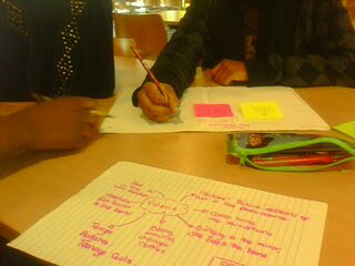
This is a list of shots that my group and I would like to achieve in our music video:

Close up of the drummers face
Low angle shots of the drummer
Close up of the drummers foot
Match on action of the singer turning the radio on
Jump cut of the singer on the stairs
Long shot
Close up of the singers face
Close up of the singers lips
Side view of the singers face when she sings in front of the mirror
Tracking of the singers movement
Birds eye view of the singer spinning around
Another close up of the singers mouth as she puts lipstick on
Close up of the singer reaching for the door knob
Close up of her feet in her leg warmers and tights, then another close up of her feet in her high heels
Panning from her shoes all the way up to her face revealing the outfit
High angle shot of the drums
Close up of drumsticks
Close up of different parts of the singer during the performance

Tuesday, 23 November 2010

Rough Cut And Feedback


Feedback

-Atmospheric lighting
- Lip syncing was good
- Simple but effective (This is what we aimed to achieve)
- Good variety of costume change
- Split screen was effective

Monday, 22 November 2010

Shooting Schedule


Wednesday 22nd September: Shooting first shots of the music video. The singer wakes up and turns the radio on.

Wednesday 29th September: Shooting jump cut of the singer on the stairs, her singing in the mirror and her spinning around. Also shots of her lip syncing.

Wednesday 6th October: Shooting in the TV studio. Shooting the singer performing using different gels.

Friday 8th October: Re-shooting first half of the music video again.

Wednesday 13th October: Shooting the band and singer in the TV Studio.

Saturday, 20 November 2010

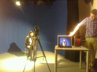
Lighting Training

Three-Point Lighting

There are three lights on the subject, the back light, the fill light and the key light.

Key Light
This is the main light and is to be placed to one side of the subject. It is usually the first and most important light. To create a silhouetted effect the key light must be removed. This light could be either focused or diffused and can be placed in a variety of angles depending on the position of the subject. In many cases the key light is used for staging or as sunlight.
Fill Light
The Fill Light fills in the shadows that are created by the Key Light. The fill light is softer and less intense than the Key Light.
Back Light
The back light provides definition.
A Bounce Board
A bounce board is a board used to reflect light on a subject. It is made of material that can reflect light from any source, i.e The sun, a light bulb. It also comes in a variety of sizes.
All three would look like this:

Friday, 19 November 2010

Taking Photographs- Photography Training


4 basic things that make a good photo

- Composition
- Exposure
- Lighting effects
- Post production

Composition

Everything in the image must be what you intended.
The main focus of the image must be thought about. I.e; Fashion magazine would involve clothes.

Exposure

How bright the image is.
High key would be a bit over exposed and low key would be a bit under exposed.
High key lighting is usually used for for beauty whereas low key lighting is usually used when wanting to make someone look "creepy" or to give an eerie or scary feel.
When trying to make an image high key, the background is always completely white. A light should be used at the back to help achieve this effect.


Thursday, 18 November 2010

Photo Shoot Plan


People Needed:
Debbie (The singer)

Costume Needed:
Blue pyjama top
Black tights
Pink leg warmers
Black dress
Pink high heels

Props Needed:
Hair piece
Glasses
Scarf

Lighting?
High key, focusing on Debbie

Location
Tv Studio

Camera Angles
We've decided to take a lot of close up shots of our singer as close ups generally give a more intimate feel and we would like our audience to feel as if they know her. While our singer is in her pyjamas we would like her to give the impression that she is bubbly and full of life, like she does in this photo:

But, when she is in the dress she performs with, we would like her to come across as mature.

Wednesday, 17 November 2010

Photo Shoot


These are a few of the photos that really stood out after we did the photo shoot. We liked the lighting and how different each side to her was.

Tuesday, 16 November 2010

Monday, 15 November 2010

Digipak Design

On the front of our digipak we will have a close up of her face with her eyes closed. The name of the album, which is "Sassy", will be written in pink italics as pink is a theme that runs throughout our music video. (Pink shoes, pink leg warmers, pink radio) To also accommodate with this theme we have decided to give her pink eye shadow.
The name of the artist, "Debbie" will be written in black and also in bold.

On the inside, instead of following the tradition of having a lyric book, we've decided to include photos from the photo shoot and also a competition to have "A day out with Debbie."


Sunday, 14 November 2010

Digipak

This was my first attempt at creating my digipak. After much contemplation, my group and I decided to re-shoot as we thought that some of our photographs weren't good enough.
Thankfully, my second attempt was much better.
I was much happier with the second version of my digipak. I decided to include an inspirational quote by Eleanor Roosevelt in my digipak; "Th future belongs to those who believe in the beauty of their dreams"
This gives a message to our target audience, that dreams are achievable and that they shouldn't let go of their aspirations. Th singer in our music video started off as a normal teenage girl but then went on to do spectacular things. Our music video is telling the audience that they should go after their dreams.

We decided not to make any of our photos sexual in anyway as it would not have appealed to our target audience and as a company we did not want to exploit our singer.

Feedback:

- Good quality photos
- Lots of bright colours that contrast (Pink and blue), but still fit in well together because of the singers eye shadow.
- As there is one key colour, it shows where the focus of the images are meant to be.

Saturday, 13 November 2010

Magazine Advert


We wanted our magazine advert to be high key lighting and quite fun.
We all decided to do our own magazine advert and at the end we chose one to represent us.
The one we chose uses high key lighting as the aim was to take a beauty shot of the singer and it featured our running motif of the colour pink.

Friday, 12 November 2010

Creating A Logo


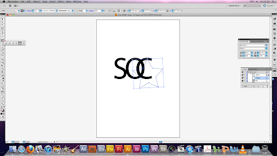
To create our logo we used a programme called "illustrator."
We decided not to use Photoshop as Photoshop uses a raster application whereas Illustrator uses a vector application. This means that if we did the logo on Photoshop and wanted to resize it once exported, it would lose quality but since we used Illustrator the quality remains the same when resized.

We decided to each create our own logo first and then come together as a group to see what was produced and to decide which one would be used.
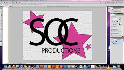
In the end we decided to use this:
We thought that as it is somewhat similar to the Chanel sign (Which I got my inspiration from) it has an expensive feel to it, but because of the stars it also has quite a fun feel to it.

Thursday, 4 November 2010

Representation Of Women

In our music video the main focus is a woman.
She is presented as a very happy character and also an ambitious character. This video could be inspiring to young girls as Debbie starts off as a normal girl as the video starts as if it is an average day, but then the audience realise that she is an ordinary young woman in an extraordinary position as she is also a singer.

It could also be seen as a girl day dreaming about being a famous singer as most girls do.


In the music video, Debbie is shown putting red lipstick on. This connotes love or lust and could also connote danger or a sense of risk. This is shown just before she completely changes into her alter ego.

Costume Analysis

Red Lipstick: This could connote love, lust, danger or risk.
View Image
We chose pink to be our motif as our target audience are young girls and this gives the video a more feminine feel to it. Pink is also a quiet colour so the audience will not be blinded by too many bright colours. Pink can be associated with calm feelings and relaxation. Pink could also be used to promote love or self-worth.
As our aim for the music video was to empower our target audience, we decided to use the colour blue as it usually represents strength, importance, tranquillity and intelligence.
We dressed Debbie's "alter ego" in a black dress, a purple bra and pink heels (To create a continuous motif.)
Purple connotes romance which tied in quite well with the song as the song is about wanting a partner back.
Black signifies mystery.